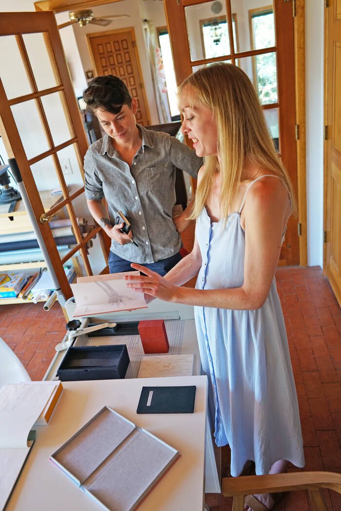
Erin Mickelson’s book-based artwork plays with translation, in every sense of the word. In LIMINAL betwixt/between, her series of work displayed in form & concept’s Superscript show in 2018, text is translated to sound, sound to image, and image fed into an algorithm, chopped up, and assembled into new images. Her collaborating artists are Twitter bots and long-dead authors, and her process a visible part of the product. In everything she makes, there’s a degree of absurdity and flux: how many times can you translate something and still call it the same thing? When does a translation take on new meaning, and when does it become meaningless? What is lost in translation, and what is gained?
Mickelson lives and operates her imprint, Broken Cloud Press, out of her home in Eldorado, just outside of Santa Fe. She has a solo show opening at form & concept in Santa Fe in November 2020.
Robin Babb: When did you start Broken Cloud Press?
Erin Mickelson: In 2013. Basically, when I finished my BFA, I started it up.
And that was at the Oregon College of Art and Craft?
Yes. That school was amazing. So I was in Madison, Wisconsin, working as a graphic designer, and I was getting really sick of just staring at the computer all the time. I ended up having a client who needed a letterpress job done. I had a friend who had a press, and she let me get involved in the printing process, like setting the type and running the press. And I was just totally hooked. That tangible, physical part of the work. Then it was like, “Oh, letterpress is a thing.” And then, “Oh, broadsides are thing, and books,” and I discovered book arts like that. I wanted to study it. So one of the few schools [that taught book arts] was the Oregon College of Art and Craft in Portland. And it was really fast: one summer I decided I wanted to do it, and then two months later, I’m moving to Portland. I’d never been there before. It was great. It was a really tiny school just kind of set in the hills. There was the book arts department, there was painting and drawing, photo, fiber arts, ceramics, metal, wood. It’s really sad that it closed down this year after, like, 112 years.
Tell me a little about LIMINAL.
Oh, LIMINAL. That was fun. That started as—I feel like all my things start as frivolous little for-fun projects, and then they blow up into monster projects. So for LIMINAL, I discovered this Twitter bot that wrote these little haiku-esque poems, sourcing from a haiku poets database. It’s basically this algorithm of selected words and, like, based on certain parameters, it would either accept or reject the lines of poetry. And then every few hours, it spits out a new poem. I thought it would be really entertaining to letterpress some of these little poems that are written by an algorithm, or bot, or whatever. So that was gonna just be a little for-fun project that didn’t turn into some big thing—and it turned into a year-long endeavor. It was this whole series of collaborating with bots and AI. I took the poem and letterpressed it. And then I made this series of prints that were really, really complicated.
The poems were selected over a period of time, and it ended up being thirty-three of them. The way I selected them was based on the haiku structure—I [selected Twitter poems from] the date that I started the project, and then I would count by five-seven-five.
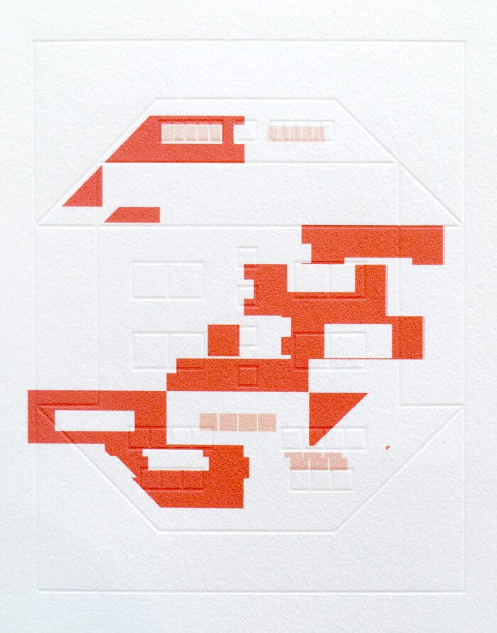
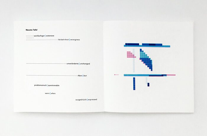
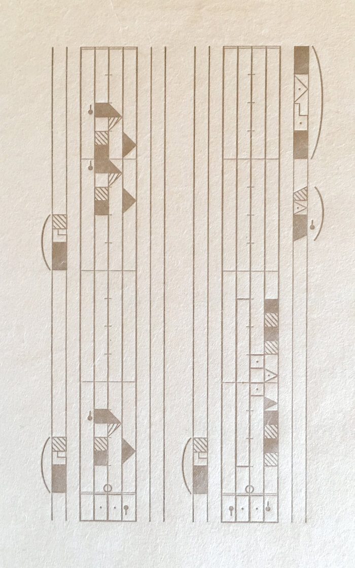
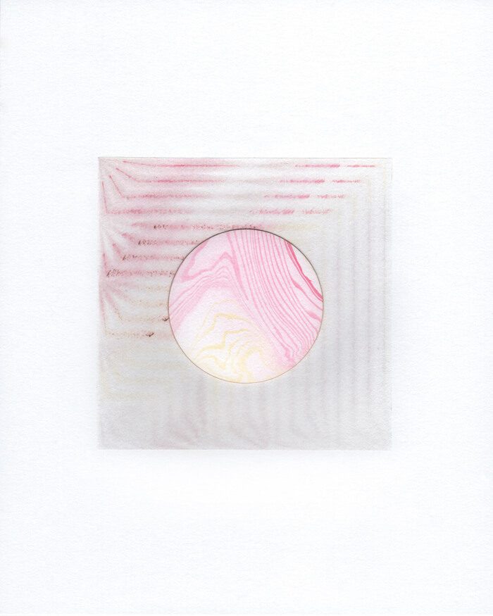
So the book is the letterpress poems, and that was the first step. And then, based on the lines of the poems and the number of characters in the poems, I did this series of suminagashi prints. Are you familiar with suminagashi prints?
Printing with the ink floating on water?
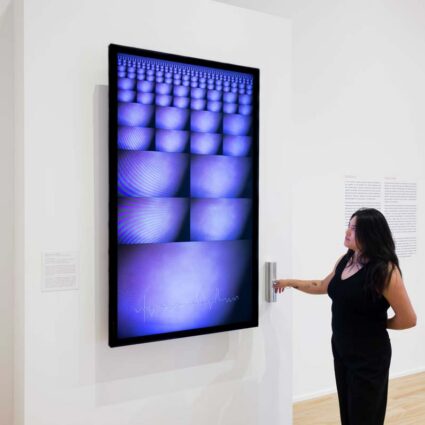
Yeah, exactly. So these are the elements of the suminagashi prints. Each of the colors represents a line of the poem. The first lines were red, and then the second was yellow, and then black. Sometimes there was a fourth line, so that was the blue line. You’re dipping the brush onto the surface of the water and making these concentric circles. The number of circles reflects the number of characters in each line of the poem. So there’s all this ink floating on the water, and then I would read the poems over the surface of the water—things as subtle as breath and sound would move stuff around. Then I would pull the print. And that’s how it started. So then I took the suminagashi prints and I sent them to a pixel-sorting bot. The bot would sort the pixels according to random parameters. I took all those elements and I made these prints, and the shapes are important. The rectangles represent the codex, the squares represent the pixel, and the circles represent the scroll. So super early book form, and then this—[Erin shows us a digital screen set into the book, which displays a haiku that refreshes every thirty seconds or so.]
This is sourcing from the Twitter bot. And it’s refreshing its feed every half hour. So you can see the current poems, and if you watched it forever, it would eventually scroll back to the beginning. But at some point, I imagine this bot will die, like the pixel sorting bot did.
That was my favorite line from your artist’s statement, “the great bot massacre of 2018.”
It was a real thing! Twitter changed their API parameters, and a lot of the art bots got killed off. If the developers didn’t update their security, it was just gone.
When you’re working on a project, what does a day in your work look like?
Well, I’m actually starting a new project right now. And the beginning stages of it are always a lot of research. A lot of research and reading. For my work, I want every decision to be intentional; I want it to have a reason behind it. Just everything from color, material, any little thing. So I spend a lot of time researching concepts. Once I have a solid concept, then I can sort of start to imagine how the work is going to manifest and how to best express that idea through material and structure, color and text and image. Pacing and rhythm is important, too, when I’m thinking about how to make stuff, how I want people to move through it, how I want them to feel. But I can only do what I intend; the experience is up to them.
Can I ask about this new project?
Yeah. So I’m doing a solo show at form & concept in November 2020—so I’m starting now. It’s gonna be all new work. Mixed media again, like book stuff, but also projection and installation. And the central theme around that is garden-path sentences. These are sentences that are grammatically correct in English, but when you read them, your brain just can’t make sense of them, and they seem like they’re out of order. And then you try to, like, re-read it, but your brain just doesn’t want to let go of that original interpretation. So one example would be, “The old man the boat.” It’s a little bit [less confusing] when it’s spoken audibly. But your brain wants to read it as, like, “The old man, comma, the boat,” but that’s not it; it’s “the old,” as a collective group, “man,” verb, “the boat.” So, anyway, I’m looking at Borges’s Garden of Forking Paths and different timelines, different layers of perception. So that’s where the seeds of the new stuff is.
I’m very interested in the ways that words sometimes don’t serve us well.
Yeah, it’s really funny how mentally exhausting it is to try to parse a series of these sentences. You just want to quit and throw things.
It makes me think of another big theme of your work: translation. Translating is exhausting.
It’s a weird kind of exhaustion.
You’ve done a lot of work around both literal translation—from one spoken/written language to another—and less literal.
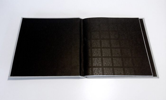
Yeah. Which reminds me of [Asterion, another book project of Mickelson’s]. This one is also based on a Borges story. And the different lines of text are—I took the Spanish translation, and I went to Google translate and told it to translate into English, and then took that translation and told it to translate into Spanish—and went back and forth until they were [almost] exactly the same. So the different layers [of text, in varying colors] are the different steps of translation. And the QR code is intentionally not functional—but that would lead you to the translate site that I used. So the whole thing is just a bunch of dead ends.
And then… this. [Erin picks up another of her projects, called Prosody & […]] Are you familiar with [Stéphane] Mallarmé’s Un coup de dés [jamais n’abolira le hasard]? He was a French Symbolist. And he wrote this poem, “A Throw of the Dice,” and it was so bizarre and typographically innovative. Like, this is essentially his original layout. It was not like anything that anyone was used to reading. Things floating in strange places on the page, different sizes and fonts. So what I did was, I broke the poem down into the different typographic voices. Like all caps, bold, italic, large, small. And I found eleven different typographic voices, and they each have very distinct feels. Like this is very bold and abrupt, and the smaller italics are more smooth and flowing. So I essentially translated those voices to movements. Simple series of movements. And I recorded those movements in Labanotation. It’s a movement notation system.
Literal, physical movements?
Yeah. So you can record, like, a full ballet.
Not to put you on the spot, but… how would you define a book?
I think about this a lot. I think about books these days as an experience that you move through. To me, that’s the core of it. And it usually happens in an enclosed or protected space. Which is a pretty open-ended definition.
What do you feel like you’re trying to do with your work?
I think it’s a combination of playing with the idea of translating. Translating between disparate forms, basically. Like movement or image, not just from text to text. And analog and digital.
Going into the future, are you going to continue focusing on melding the analog with the digital, and the letterpress with the laser printer?
Yes. That’s my happy place. I feel like people just think they’re so disparate and can’t play together, but I think that they can definitely be friends. There are ways for them to mix really well.
This issue’s Studio Visit is sponsored by form & concept.

All editorial is directed by The Magazine and its bylined contributors.
Erin Mickelson was selected by the editors prior to form & concept’s sponsorship.