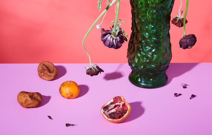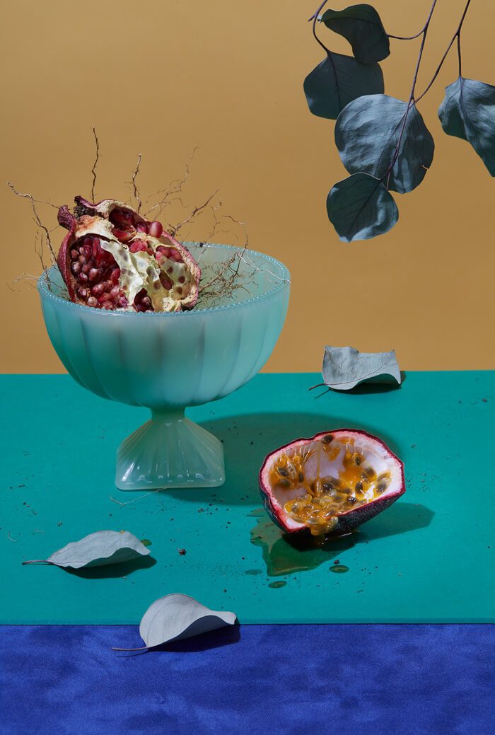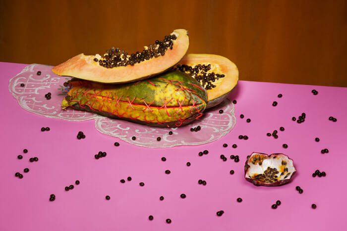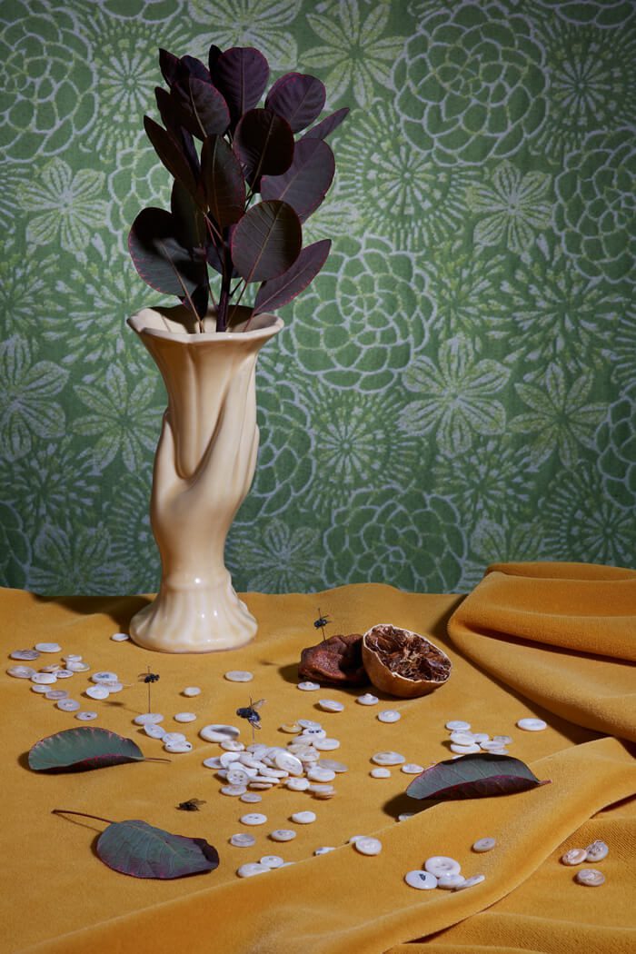
Santa Fe photographer Inga Hendrickson is no amateur when it comes to still life. One look at her commercial work confirms that she is technically adept with lighting and arrangements. Her personal work, in particular a series called The Color of Decay, carries her commercial sensibilities over into the realm of fine art with thoughtfully composed, brightly colored images. At first glance, these scenes are easily consumable with their overall glossy look, but upon closer examination, their insidious nature is revealed. The images’ heightened stylization offers an opportunity to linger on the revolting, to think of one’s inevitable death, or perhaps to imagine dining at a restaurant littered with dead flies and the jarring smell of rot, something like a memento mori. More often than not, appealing aesthetics are a vehicle for something ultimately unsavory. Hendrickson capitalizes on this contrast with the language of advertising and creates vignettes that appeal to base sensory indulgences, reminding viewers of their own fleshy and mortal existence.
The gesture is endearing, to care for something broken, even when it will not result in salvation.
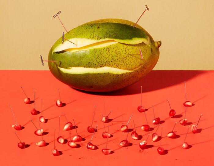
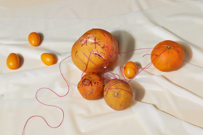
In one image, an overripe white lily in a shiny, ceramic vase drops its pollen over an open head of garlic and a garden onion. One can imagine the intermingling of their odors. The repugnant sensation is countered by the saturated oranges in the background that are perfectly flat and pure. In another image, the artist has pinned individual pomegranate seeds to a red tabletop and reattached the skin of a papaya with T-pins. The effort might seem sadistic or pointless. Why would one try to repair a papaya? Or secure bits of fruit to a tabletop? In other photographs, the artist has stitched ruptures in rotting oranges closed. The gesture is endearing, to care for something broken, even when it will not result in salvation. These scenes nearly all take place in contextless fields of color.
Context helps to situate an image, and without it, cues come from whatever is available—like color. Blues recede into the picture plane; warm tones move forward, each with its own host of associations. An image featuring a glass candy bowl uses color placement to play with optical illusions, creating a super-flat picture. These elements, coupled with the kitsch of the candy bowl, feel like a callout to vintage cookbook illustration.
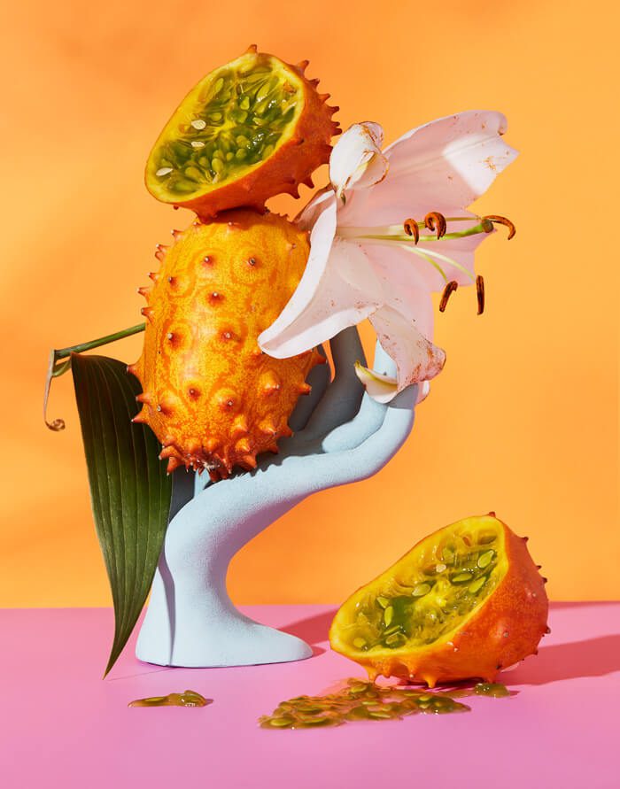
Kitsch carries through the series with the use of vintage glass vases, an antique hanky, and a plastic model of a woman’s hand, the type usually found in the windows of nail shops. These items photograph well, proven through their use in mid-century advertising. Even the fruit, which tends to be of the tropical variety, translates nicely to photography. A Kiwano melon, usually found in the exotic fruit section of a New Mexican grocery store, has a bright orange exterior with slick, gooey, green seeds that seem to pour out when the fruit is opened. The fruit, pictured in various states of decay in one piece, goes from sumptuous to icky, a reminder of time’s urgency.
The artist manages to make gross look so good in a way that I’m happy to experience mediated through photography. Perhaps it’s like this: similar to the recipes in the 1961 edition of the Joy of Cooking, the glossy jello molds or the vibrant cheese balls just never come out as good as they look in the pictures. It’s better to admire the pictures than attempt to make them a reality.
