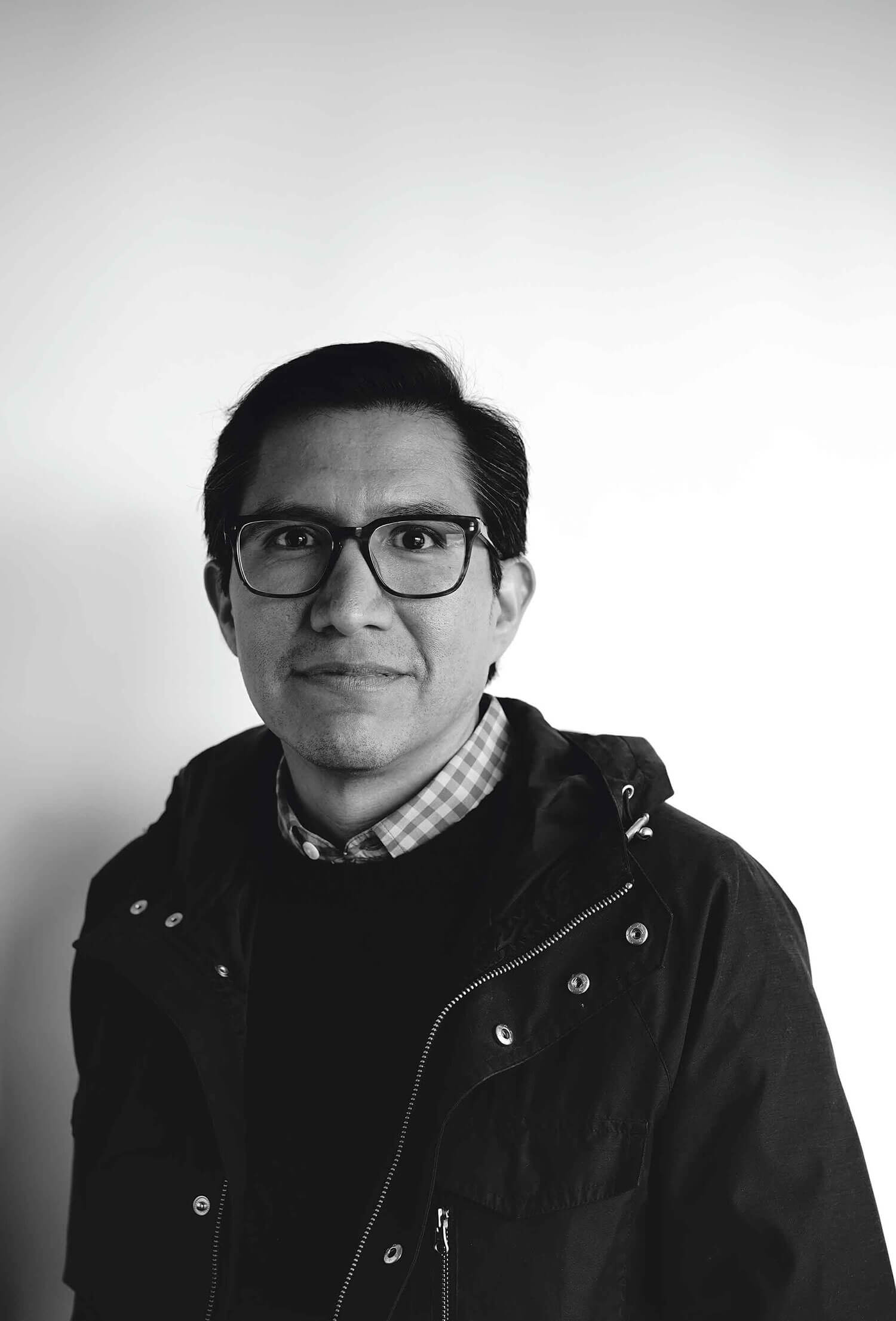
Michael Namingha has the admirable ability to reveal the irony of language and words on the one hand and, on the other, to cut landscapes apart, fracturing them into sometimes-repetitive images that cascade beyond any typical frame. Words are like objects in his work, in some cases graphically inverted so that they are no longer familiar, even legible. Landscapes, otherwise, have subtexts, often yielding deeper and darker realities to those willing to look. At first glance, these two aspects of his practice occupy opposing poles, but after talking with him at his home and studio in Santa Fe, that was not the case. They are complementary.
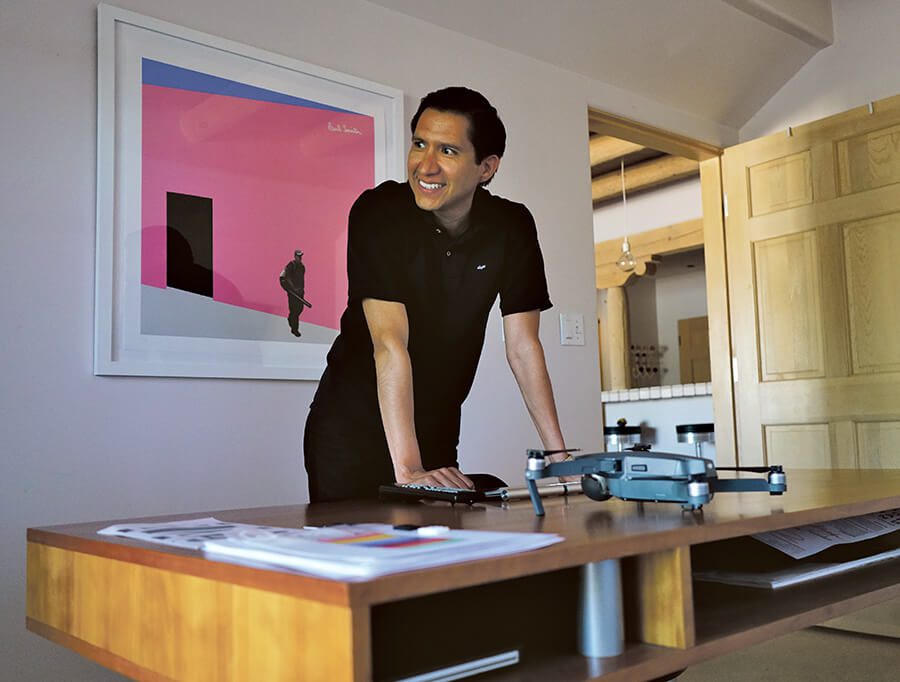
We began by looking at a work in progress in collaboration with the Georgia O’Keeffe Museum about the “The Black Place.” Michael opened his digital files in Photoshop on a high-definition screen that sprawled across the wall.
Clayton Porter: Do you have a project in mind for Georgia O’Keeffe footage?
Michael Namingha: I’ve been wanting to explore the area that O’Keeffe called “The Black Place,” and we were finally able to make the trip. It was interesting that day because Cody Hartley and Carolyn Kastner, of the Georgia O’Keeffe Museum, had been out there two years ago, and there was not much in terms of infrastructure. On this trip there were so many oil companies that have set up different stations along the road that lead to the Black Place for pumping and processing. You can’t really go that far without running into signs that say there is a gas line running underneath. That area that O’Keeffe painted now has a pipe running on top of the landscape. Visually, it’s painted the color of the earth. You know it’s there, but it blends in. Some of the other stations are painted this kind of army green, so you almost feel like you’re in a war zone. Initially I used Google Earth for my work on the Black Place. I go in between Google Earth images and images taken from a drone, and a lot of times I’m surprised at the type of resolution I can get with Google Earth Pro. I used these blocks of color, originally in the Galisteo Basin series, that would go over a piece of the landscape, and it was a piece of the landscape that would not be there someday. This is the second interpretation of that.
Alicia Inez Guzmán: Where did this project begin?
It actually started for me in the Galisteo Basin, and that’s when I started exploring what happened there and what continues to happen there. I started a series called The Galisteo Basin, and that led to another series based on the Grand Canyon. There is a proposed billion-dollar resort that is supposed to go in on the edge of the Grand Canyon called the “Escalade Project.” It’s a gondola that will descend down into the canyon at the confluence of the Little Colorado and the Colorado River, and the plans are to also have a small village built to house some of the employees who work at the resort. A lot of people always ask, “Well, how is it possible to build something that big on the Grand Canyon?” and it’s because it sits on Navajo land. This corporation was very opportunistic and actually placed the former tribal chairman on their corporate board, and so they’re trying to get through a series of hurdles in order to get the final approval from the Navajo Tribal Council. It’s already failed one of the meetings, and it’s on the second or third. I think there are eight that it has to go through. My works on the Grand Canyon are commentaries on that project.
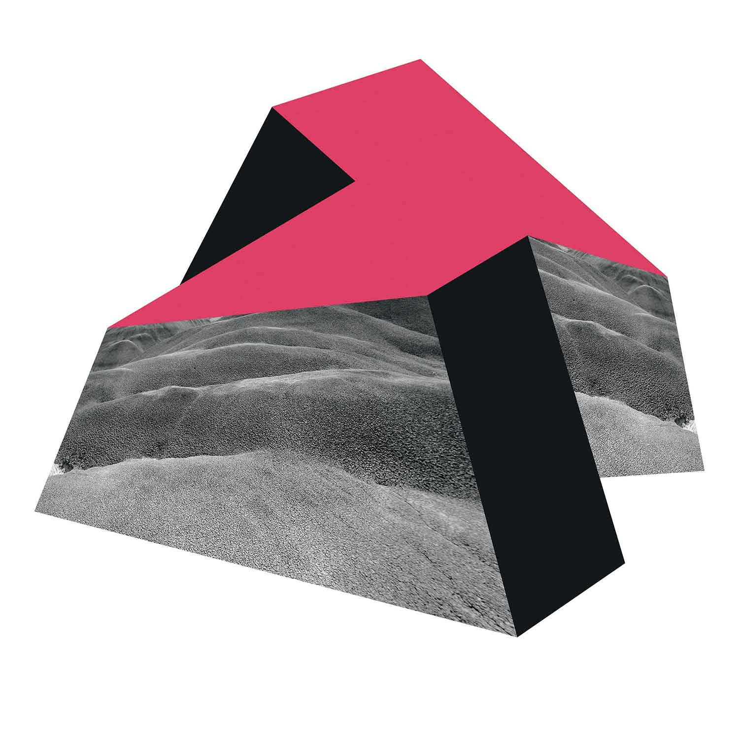
Edition of 2. Courtesy the artist.
AG: This reminds me of Hopi House.
Yes, my great-great-great grandmother, Nampeyo, was the first Hopi invited to live and work at Hopi House along with my great-great-great grandfather. There’s a long history. I knew the story that was part of my family, but I didn’t start reading about it until I was part of this exhibition that had to do with Fred Harvey. The exhibition was at the Santa Fe Arts Commission Community Gallery last summer. It was titled The Train Must Be Fed. New Mexico artists were invited to create work surrounding Fred Harvey and his development of the hospitality industry associated with the railway and its impact on this region. I did a vinyl wall-text piece where I pulled from some reading I had done on Harvey. Fred Harvey had a journal where he kept a list of maxims for businessmen. One of them read, “Don’t waste time in useless regrets over losses,” which is such a great quote. In more of my research, I read of my great-great-great grandmother Nampeyo, who was a Hopi potter invited in 1905 to live and work at the Fred Harvey Hopi House at the El Tovar hotel at the Grand Canyon, in addition to being featured in several World’s Fairs. It’s always fun for me to come across Nampeyo. I was at the Metropolitan Museum in New York City a couple years ago and came across pottery by Nampeyo on display next to a painting by Salvador Dalí of Christ on the cross. I loved that wacky juxtaposition.
I also find that by constantly working, sometimes I don’t have a clear path or direction, but in the process I discover something and then it begins to click together.
AG: When it comes to process, do you do archival or historical research for projects and also go out on photo shoots?
Lately I’ve been reading artist biographies from Noguchi, Twombly, to Rosenquist; it’s always fascinating to read about their process, hurdles, and overall life experiences, which help to humanize sometimes-mythic figures. A lot of times I come across ideas reading news articles. Then I start to research more than what is on the surface and start to uncover a whole narrative that somehow fits within what I’m working on aesthetically. With the Grand Canyon series, the story and the images had a very serendipitous way of occurring. I also find that by constantly working, sometimes I don’t have a clear path or direction, but in the process I discover something and then it begins to click together. For the Galisteo Basin series, I went out there actually to take a pretty picture without any intention of doing anything. Then I saw all of these signs that said, “No Oil in Galisteo!” or “No Drilling in Lamy!” When I got back here I started doing research as to what that story was. All that history went back to the 1970s with the first sustained exploration effort by oil companies.

CP: Did design play a role in your development?
After high school I took a series of classes at the Santa Fe Art Institute. Back then they were doing these two-to-three week intensives with master artists, so I studied with John Baldessari, Judy Pfaff, Fritz Scholder, Manuel Neri, Donald Lipski, Stephen Auger. It was with Baldessari and Judy Pfaff that really helped push me into exploring what I was doing photographically. The work I was doing then was taking photographs or magazines and xeroxing them onto transparency sheets and layering them on top of each other on top of a light table. I would get these strange moiré patterns or overlapped Rorschach patterns. That was right around the time that inkjet printers came about. A photographer friend of my dad’s, who was photographing a lot of my dad’s work, bought one and said, “Do you want to try using this weapon?” I’ve been using inkjet prints since 1997. After SFAI, I went to Parson’s School of Design for Design Management, because I was intending on going into the fashion industry. I thought I wanted to be a creative director of a company. That’s where the design element comes in—whether graphic design, or something that balances form and color. I’m mixing those skills together. I got to work on a project doing product development for Hermès for their home collection, and then 9/11 happened. A lot of us that were in the city just got thrown for a loop. A lot of our intentions regarding why we were there completely changed, and that’s when I starting thinking that I didn’t want to go in that direction—or fashion at least—and channel it toward an artistic career. I came back here in 2006.
AG: Would you say that the text-based series and the landscape series are similar to the extent that there’s the face value and then there’s the subtext?
I used to use more of the text-based series. I’ve always played with that since 2003. I’ve always had text in a lot of pieces. You can read it as it is on the surface, or you can take it in a completely different direction. That’s kind of like this series that I had 3-D printed recently, titled Worschach, which is a combination of “word” and “Rorschach.” I was just taking words and mirroring them, and when you combine them, they become a little bit abstract and you can’t quite read them. You turn “Fuck” upside down and it looks like a face with really crazy eyebrows. When I started using a phrase like “Kiss Me,” or when it gets beyond one word, it gets more complicated. All the time I’m always recording conversations I hear, words, and phrases. Usually I’m jotting them down somewhere, and I keep a list and just pull from those. I like taking something out of context and putting it in a new context. It’ll completely change its meaning.
CP: Your text-based works Indian Giver and Indian Burn are really charged, especially in this community. What kind of response have you gotten?
A lot of people get really uncomfortable. I had a collector from Los Angeles buy Indian Burn, and another collector said, “I love Indian Burn, but I’m not sure I feel comfortable hanging that in my house.” I kind of like that, making someone uncomfortable, because it was something I grew up with, and yeah, it made me feel that way.
Words like acorn, nectar, and mistletoe were replaced with words that related to technology like voicemail, MP3 player, and Celebrity with a capital C.
CP: Did you get any feedback from other Native artists or activists?
Not yet. There were a lot of Native artists from the early ‘70s and ‘80s at IAIA that were activist artists, and they were putting that kind of content out there. Now with Frank Buffalo Hyde, Cannupa Hanska Luger, they’re putting it out there again, how their culture is represented. I was in an exhibition last year with Nicholas Galanin, Cannupa, and Postcommodity at the Museum of Northern Arizona, and the exhibition was titled You are on Indian Land. I had used a series of photographs that I had taken on the pilgrimage to Chimayó. It’s a series of signs that I encountered on the way that Evangelical groups had left, saying, for example, “How often do you look at someone with lust?” or “Are you sinless and perfect?” or “Are you even good?” It’s building all of this guilt upon whoever is encountering these on this very religious walk. But when you look back at the history of place, it used to be sacred to Native peoples, and when the Spaniards came, they built this church on top of it and it changes the feeling of that space. It was appropriated by another culture, and there are all these different underlying stories and layers to place, culturally.
AG: You have an upcoming project at the Botanical Gardens with your father and brother. Is that about recontextualizing information, too?
Yes, that actually stems from listening to a talk by Terry Tempest Williams about how the Oxford Junior Dictionary recently removed a series of words relating to nature. Words like acorn, nectar, and mistletoe were replaced with words that related to technology like voicemail, MP3 player, and Celebrity with a capital C. Even MP3 player seems a little dated already. This series of works has so much to do with the changing and vanishing landscape, and not only is that happening, but the language that defines it is disappearing. I’m putting those words that were pulled from the Junior Dictionary and placing them on little markers throughout the garden that normally mark a tree or plant, except now there will be just a barren piece of landscape. P
Conception, Abstraction, Reduction: The Art of Dan, Arlo and Michael Namingha opens at the Botanical Gardens on June 10, 2017.

