Ta-da! Southwest Contemporary, a leader in arts and culture coverage in the Southwest, punches above its weight in a revamped print magazine!

Southwest Contemporary, in response to overwhelming reader demand, is downsizing.
We’re still publishing the same volume of arts and culture content, from all across the Southwest on our various platforms. We also won’t be cutting our staff or freelancer team.
It’s the way we’re presenting stories—specifically our print products—that’s getting a makeover.
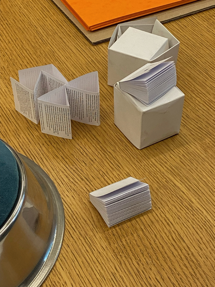
Loyal readers, we’re proud to introduce: our new magazine size!
SWC’s diminutive print design, with a two-point typeface, is not only streamlined and more eco-conscious, but also infinitely more portable.
We were partially inspired to make the shift by a scene from Charlie Kaufman’s 2008 film Synecdoche, New York (starring Philip Seymour Hoffman), in which paintings by Adele Lack (Catherine Keener) become smaller and smaller over time. Each time Lack’s works shrink, viewers respond ever more enthusiastically, leading the artist to attain art-world success and acclaim. We believe our bold redesign will produce a similar legitimizing function for Southwest Contemporary.
“Printing costs have gotten out of control over the last few years,” remarks SWC publisher Lauren Tresp. “But we didn’t want to cut pages, so we came up with this really innovative strategy to shrink the publication itself. This is a much more sustainable way to stay in print, even if legibility is an issue.”
“Due to concerns about impending climate catastrophe, we were really looking for a way to reduce our footprint,” adds arts editor Natalie Hegert.
Like the micro paintings in Synecdoche, New York, you’ll need a magnifying glass to read our dynamite arts coverage in our miniature, pocket-size folio.
Happy reading (and squinting)!


